With only just over a month before the ‘crit date’ for Project 2 (Hand Crafted Textiles) I had only made up my mind last week as to the content of my proposed visual research. I had toyed with the idea of ‘charity shops’ until I realised that I might have trouble defending this area as a cultural artefact! There are eight charity shops in Wakefield. All of them have very distinctive logos using a maximum of three colours, and several shops organise clothes on display by colour, not by size. I had (stupid?) ideas about designing a range of woven bags or tea cloths associated with the visual design message of these (mostly) national charities.
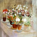
As the first workshop day of 2009 approached I realised I had to be more pragmatic and choose something a little closer to the letter of the project expectations. I’ve chosen to focus visual research on the abstract paintings of Winifred Nicholson. I already have a small collection of books of and about her work, and access to her son’s limited edition monograph Unknown Colour, the only source that details the ‘story’ of these abstract canvases. Very simply, this painter, known principally for flowers and landscapes, spent several years in Paris immediately after her marriage ended to Ben Nicholson. There she studied and became friends with Braque, Mondrian, Picasso, and Arp. She put away her flowers and produced a series of extraordinary abstracts (with just a few lovely portraits of her young children who accompanied her to France). World War II intervened and she returned to Cumbria and war work, her abstracts put on one side until the 1970s when they were first shown (to some amazement) in London.
I have decided to explore a small group of these remarkable paintings as a source for woven colour and structure. To enrich the visual research element I hope to examine the context that surrounds these paintings: just how they ‘connect’ to her previous work and her life, preoccupations and influences. Landscapes, flowers, her children, her friends, her home are all captured in paintings that are a distinct and wholly original ‘take’ on the modernist project that from the mid 1920s she signed up to. I intend to study at least one painting ‘in the flesh’ at either Leeds, Sheffield, Manchester or Bradford city galleries and to experience for myself something of the luminous quality so often described as belonging to her work. She often talked and wrote about searching for ‘the unknown colour’ ( the extra colour of the rainbow she called it – indeed the rainbow and the prism fascinated her throughout her long life). Winifred often referred to painting as ‘unweaving a rainbow’. In the early 1950s she became a close friend of the poet Kathleen Raine whose poems often invoke elemental things, ‘the doves, the rainbow, echo and the wind . . .
I’ve set seven of Kathleen Raine’s poems to music in a large-scale song cycle Stone and Flower. It was during writing this cycle (for the Barbara Hepworth Centenary celebrations in 2006) that I first discovered Winifred Nicholson’s work, in a painting of Ullswater in Cumbria, where at nearby Martindale Raine created her first collection of poems, published in 1946 with illustrations by Hepworth.
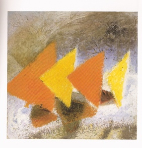
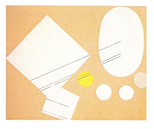
I started my workshop day with a notebook, my watercolour crayons and Andrew Nicholson’s book Unknown Colour. First, I chose to look at a very bright abstract called Triumphant Triangles (1930). After about 20 minutes of making a colour analysis I realised that behind the orange and yellow triangles of this painting was a formidably rich and complex texture of colour that I couldn’t hope to ‘unweave’. So I chose a much simpler abstract with a tiny palette of colours called To and Fro (1931). Just making a coloured sketch of this painting revealed so much, taught me so much. Actually, I was astonished at what I’d missed in the first 10 minutes of study. I started to discover colours I hadn’t noticed, shapes I’d not acknowledged. Furthermore, I realised that I didn’t possess the critical verbal language needed to describe the painting (I’ll have to do something about this!). I ‘now’ understand why painters so often make copies, and how important an activity that can be. When I studied Bridget Riley’s work for a sequence of chamber works called Touched by Machine? I remember coming across copies she’d made of Seurat’s work, whose complex pointillist approach showed her the way towards the optical play and engagement with the viewer that is such a feature of her work. I suppose when I trained as a composer there was still an expectation that one explored pastiche (this sadly rarely happens anymore). I remember being quite adept at creating Debussy and Copland. More recently I’ve focused on Beethoven’s Cello Sonatas, beginning a series of ‘commentaries’ that say what I think they mean for musicians and listeners today. Just last year I put Howard Skempton and Kevin Volans under the magnifying glass in an effort to learn to be simple, to say one thing and one thing only.
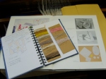
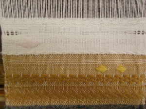
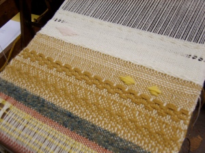
As I started to look for yarns and make wrappings I became completely convinced I was on the right track for this project. It not only had lots of potential for visual research and design development, but I could also use this material in the market research and fabric realisation part of the project ( I could see how these hand-manipulation techniques of leno and inlay could play a lively and effective part in taking the elements of a Nicholson abstract into the woven medium). As to the mood board element in visual communication, I’ve started to consider a more radical mode of presentation than the one suggested in our project brief – but more on that anon.
I began my take on To and Fro with the briefest of sketches. I really wanted to see what happened when I worked directly with the colours and shapes of the painting. I started keeping careful notes of everything that I did, but soon the rush of ideas and the desire to improvise and experiment made me put all recording aside. Very foolish really – so next week I’ll come armed with my voice-activated recorder so that I can just speak the sequence of raised shaft patterns rather than try to decipher them (unsuccessfully) from the weave later on.
Doing inlay was no problem, but leno took a few experiments and mistakes before I remembered just how to do it. It’s role in this woven sample is but a token one, but enough to see that working with leno would enable me to produce shapes in the weave such as the lozenge that feature in To and Fro. Altogether my first workshop day of 2009 was thoroughly satisfying, and I came away feeling that getting this second project together was not only possible, but had such possibilities too.

